Table properties and functionality
As you probably know already, Vue allows properties to be passed to a component when it is used, which is basically the interface of the component and allows more control over it.
<modular-table
    :data="myTableData"
    :definition="myTableDefinition">
</modular-table>
Basic
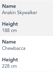
- data- One of the mandatory props of the table. Simply the data you want the table to display. Type: Array consisting normal or JSON objects.
[
    {
        name: "Anakin Skywalker",
        height: "188",
        mass: "84",
    },
    {
        name: "Chewbacca",
        height: "228",
        mass: "112",
    },
    {
        name: "Han Solo",
        height: "180",
        mass: "80",
    }
]
- definition - The definition of how your table made with the TableDefinition class. For more detailed information look up the Table Definition chapter in which it is explained in detail how to define your table. Type: TableDefinition
- sorting - The sorting information of the table. First you need to mark a column as sortable through the TableDefinition and then you need to bind this property so the table can update its sorting information. Type: Object
{
    direction: 1,
    field: 'name'
}
Note: Where direction 1 is ascending and -1 is descending. Vue-modular-table's sorting does not yet support multi-sorting so the sorting object always contains one field and direction.
- sortIcons - By default the table will use the basic unicode arrow icons: ↕ ↑ ↓. Through the property sortIcons you can pass your preferred icons that will appear when a field is being sorted. Type: Object
The object should have the keys "asc" for ascending, "desc" for descending and "none" for when the column is not sorted, but indicates that it can be sorted. The following example shows how you can use font-awesome icons instead of the default unicode arrows.
{
  asc: '<i class="fa fa-sort-up"></i>',
  desc: '<i class="fa fa-sort-down"></i>',
  none: '<i class="fa fa-sort"></i>',
}
Responsiveness
The table supports basic responsiveness for mobile devices. If it switches to mobile mode the column headers disappear and the header is added before every field.
The switch to mobile view depends on two properties:
- device - Type: Number. The number represents the current device that the table is displayed on. Usually going from 0 - Mobile, 1 - Tablet and so on. If you plan on using the mobile version of the table you should bind this property with dynamic variable that changes as the screens size changes
- mobileViewThreshold - Type: Number. Defines from which number below the normal view will be changed to mobile view. The default is 0 which means that only if device is 0 the mobile view is triggered.
Loader
Vue-modular-table provides a simple loader with debouncing logic. The loader is also a slot and can be changed at your discretion. Read more about slots later in this chapter
- isLoading - Type: Boolean. Bind this property to variable that changes to true when the request is waiting for response and comes back to false after the request responds.
- loaderWaitTime - Type: Number representing milliseconds. Here is the debouncing property through which you can change how much the loader should wait before it appears. Default: 250.
CSS classes
In the table definition you can directly pass CSS classes and format the fields. Through these properties you can pass your classes to the table. The classes have default names and you can choose to write styles on the default classes or pass your prefered names. The type of all properties below is String.
- wrapperClass - Attaches to the div that is wrapping the table. Default: modular-table-wrapper.
- tableClass - The normal view of the table. Default: modular-table.
- tableMobileClass - The mobile view of the table. Default: modular-table-mobile
- loaderClass - Attaches to the div responsible for the loading. You can also access the span inside. Default: loader
Table events
Vue components may emit events on which you can subscribe. Our table currently has only one event.
- modular-table-sort - If in the definition a column is marked as sortable and the header is clicked, this event will fire. It will carry the sort object as a payload.
Slots
Slots allow you to insert your pieces into a component. If you don't know how they work look up the documentation of Vue.
- loader - Allows you to insert your own loader instead of the default one. Note that it is still dependent on isLoading property.